A Senior designer with a passion for branding, design and always eager to try something new, currently living in Brazil.
Currently
I’m currently taking on projects, collaborations and freelance work while using my extra time to learn and explore new techniques. Feel free to get in touch if you’re interested in working together or just want to have a casual chat.
Previously
I’ve been fortunate to work with wonderful people in amazing places around the world
- ESPM 3D STUDIO Porto Alegre
- ↳ Founder and 3D Enviroment CG
- DM9 Sul Porto Alegre
- ↳ Designer Plenum, POS, PDV, Visual Merchandising, Graphic Designer
- Agência Escala Porto Alegre
- ↳ Designer Senior, POS, PDV, Visual Merchandising, Graphic Designer
- Agência Santa Clara São Paulo
- ↳ Designer Senior, POS, PDV, Visual Merchandising, Graphic Designer
- Kreativ Studio Porto Alegre
- ↳ Designer Senior, POS, PDV, Visual Merchandising, Graphic Designer, Illustrator
Brands I’ve worked with
Rio Bravo, Elegy, Loungerie, Reebok, Stella, Olimpikus, Umbro, Fila, Stihl, Livelo, Tramontina, Brinox, Shopping Iguatemi, Farm, Melissa, Bontempo, Pontal, Sicredi, Melnick, Tufi Duek, Colcci, Forum, Pompeia, Stella, Samsung, Outback,…
Specialize
Point of sale, visual merchandising, consumer experience, photography direction, illustration, character development, motion, video editing, branding, social media, web design and UI design.
Softwares
Photoshop, After effects, Premier, Illustrator, Indesign, 3ds Max, Vray, Procreate, Figma, Adobe XD, Notion, Miro and a few others that I’m testing.
Selected work
Elegy
In this project, we developed the company’s naming and branding. The name was chosen to evoke a call to action: the act of changing the world depends on each of us and our individual choices, creating a collective impact. That’s why we chose “Elegy” (from “elect” and “list”) and “energia,” representing the choice of clean energy. From this foundation, we created the branding, focusing on a pluralistic approach to communication that engages different audiences in a dynamic and vibrant way.
Frigorífico Estância
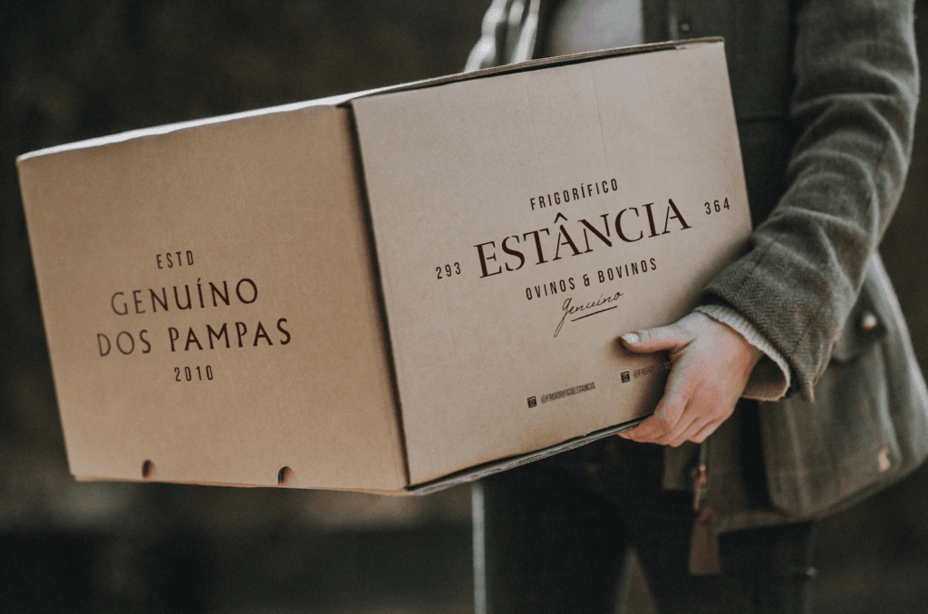
Frigorífico Estância’s new identity was designed with a focus on the public with greater purchasing power, precisely because of the type of cuts they work with, noble cuts. We thus created a more minimalist and rustic communication, with stencilled typography and serifs, a more sober color palette and images that recall tradition with elegance.
Rio Bravo
Our branding process begins with the focal element, essential to the future and indispensable to the new generation of investors.
So the new identity started with the circular element, creating patterns that allow for versatile applications. The idea of movement is further emphasized (modernity and dynamism), while minimalism is left aside (lightness and elegance).

Ducado
We didn’t just create the identity; we developed the entire branding, including direction, capturing and processing photographs, and crafting the visual and verbal narrative.
Melissa
This project was created by Makers for Estúdio Casa. We designed environments that were Instagrammable, providing the public with a colorful, immersive experience that brought the essence of Melissa to life. The electrifying colors and distinctive design of the famous sandals were reflected in each room. In this space, visitors can explore the product portfolio and immerse themselves in the brand’s universe.

Loungerie
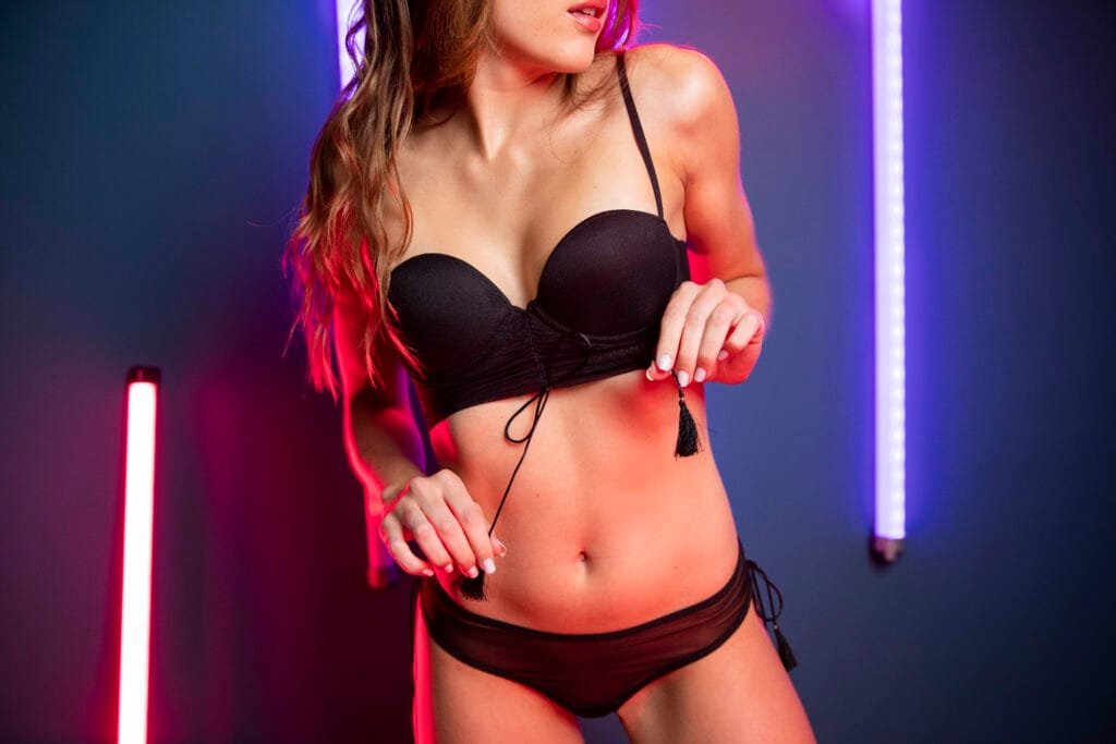
Thus, the new identity began with the understanding that the brand’s purpose is to provoke each woman to express her individuality. Inviting each woman to be Bold, Close and Inspiring. We thus created an expressive language, an invitation to celebrate oneself.
Stihl
At the start of this project, we faced a challenge: sales of battery-powered products were underperforming, and we weren’t selling many items (Stihl identified this issue for us to address).
With this challenge in mind, our CEO observed during field research that battery-powered products were not being showcased in the right points of sale, and there was no suitable sales channel for the target audience consuming these products.

Samsung
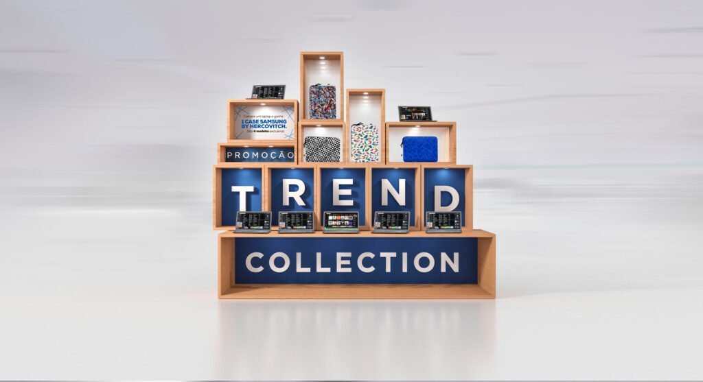
We created a multibrand store POS to promote a new campaign for notebook cases designed by Herchcovitch for Samsung.
Stella
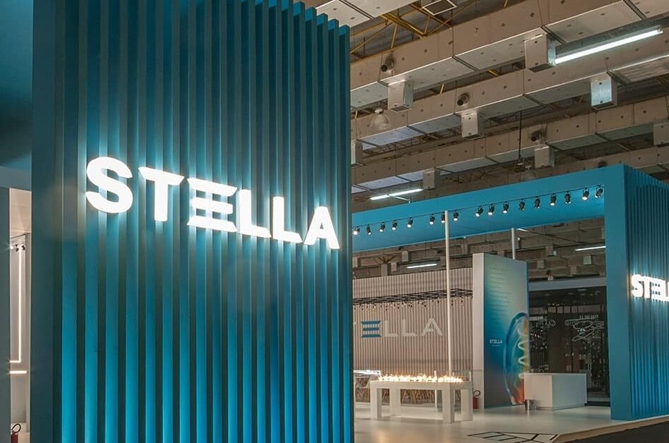
For Stella, we created a stand for the high-end public, with a minimalist design reminiscent of the Scandinavian style emphasizing the light that is the brand’s product.
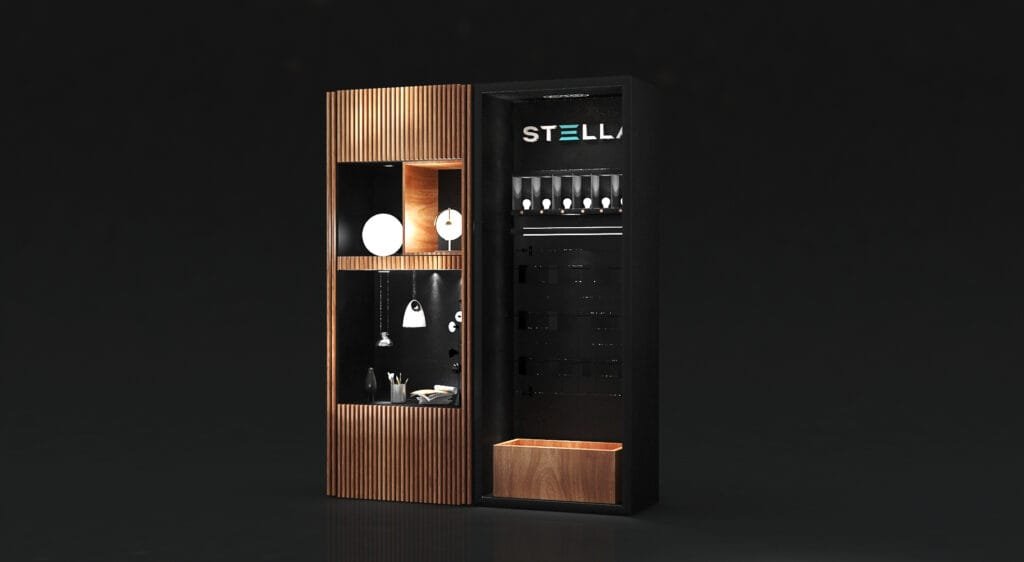
Stella
For Stella, we created a POS of multi-brand stores focused on the high-end public, with a minimalist design reminiscent of the Scandinavian style, but dark to emphasize the light that is the brand’s product.